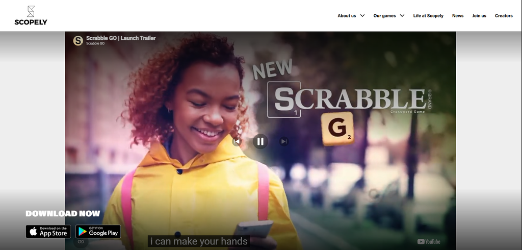
Scrabble GO is a mobile word game created by Scopely that brings the classic Scrabble board game to your phone. The website is designed to introduce people to the game, show off its features, and encourage visitors to download it. Scrabble GO has received recognition at the Webby Awards, including a 2026 win in the Best Puzzle, Trivia, Card & Word Games category.
What Is the Website About?
The main purpose of the website is to get people interested in downloading Scrabble GO. It is made for people who enjoy word games, longtime Scrabble players, and anyone looking for a fun mobile game to play by themselves or with friends.
The first thing visitors see is the Scrabble GO logo and the headline, “The #1 Classic Word Game with More Ways to Play!” I think this is a good way to introduce the game because it immediately tells visitors what the website is about. There is also a download option near the top, so people do not have to search around to find where they can get the game.
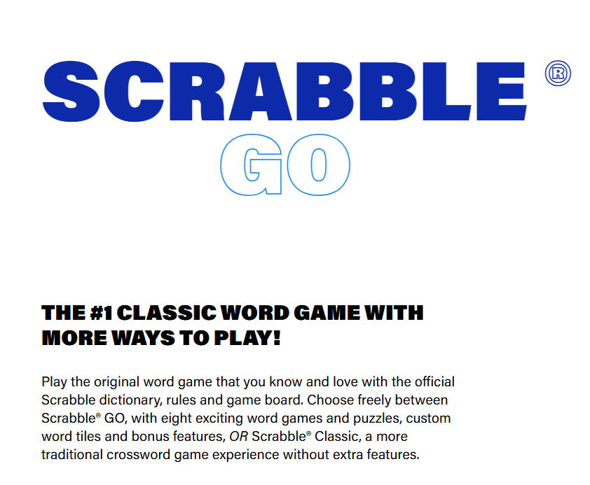
The website explains that players can choose between Scrabble GO and Scrabble Classic. This is a nice feature because not everyone wants the same gaming experience. Some people might enjoy all the extra features, while others might prefer playing the traditional version of Scrabble.
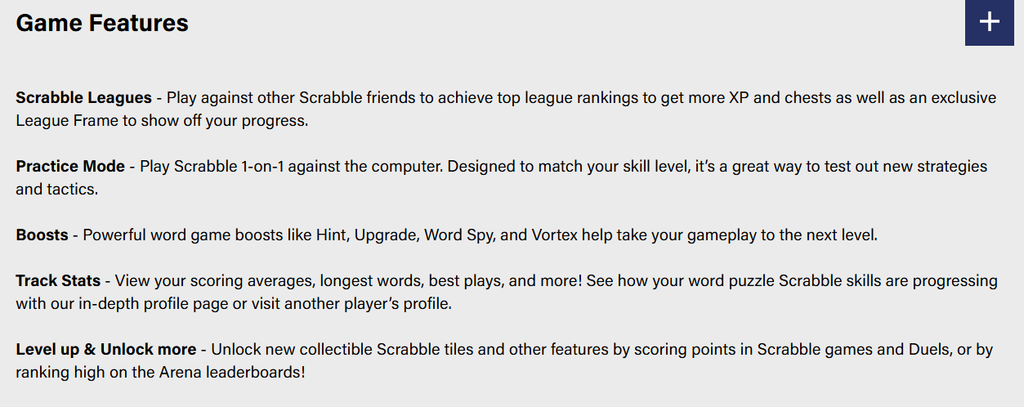
As you scroll down, there are sections showing the different features of the game. One section focuses on the different tile designs players can collect. Players can unlock chests and find new tiles, including special designs.
There are also descriptions of features like Scrabble Leagues, Practice Mode, Boosts, and player statistics. These features give players more things to do besides just playing a regular game of Scrabble.
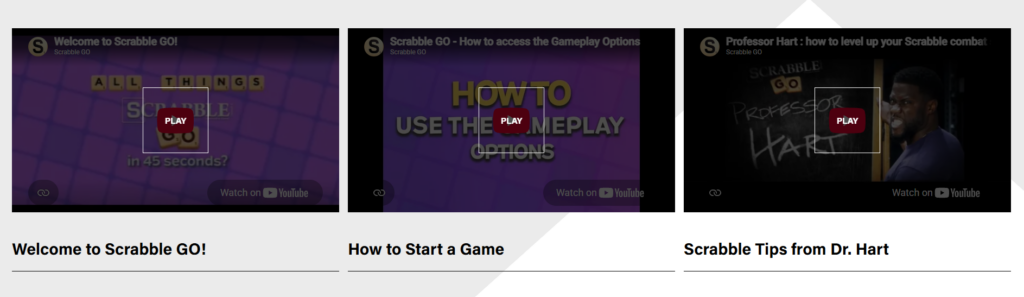
I also like that the website includes videos at the bottom of the “Game Features” section. This gives visitors another way to learn about the game without having to read through all the information. Some of the videos include “Welcome to Scrabble GO!,” “How to Start a Game,” and “Scrabble Tips from Dr. Hart.” I think this is a nice addition because it makes the website more interesting and gives visitors a better idea of how the game works.
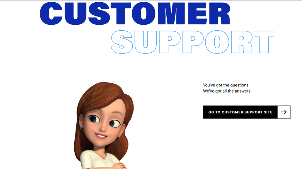
At the bottom of the website, there is a “Get in Touch” section that gives visitors a few different ways to connect with Scopely. The section has a large, bold heading that stands out against the black background, along with a character image that makes the page more interesting. There is a customer support link that takes visitors to a separate page where they can get help with questions or problems.
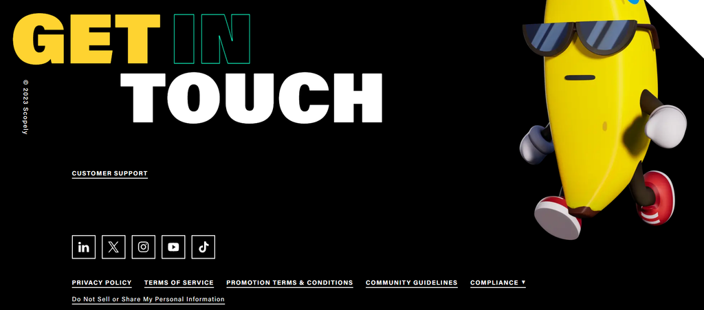
Below that, there are icons for LinkedIn, X, Instagram, YouTube, and TikTok, making it easy for visitors to find Scopely on social media. The bottom of the page also includes links to the privacy policy, terms of service, promotion terms and conditions, community guidelines, and compliance information. There is even an option that allows visitors to manage how their personal information is shared. I like that Scopely includes all of this information in one place instead of making visitors search for it. The design also stays consistent with the rest of the website while making the important links easy to find. Overall, this section is a good example of how a website can provide helpful information while also giving visitors ways to stay connected with the company.
Design and Appearance
One of the things I like about the Scrabble GO website is how it uses the original Scrabble branding. The logo, some colors, and game images make it easy to recognize what the website is advertising. Since Scrabble is already a well-known game, keeping some of its original look helps connect the mobile version to the classic board game.
The website is also easy to look through because each section is clearly separated, making it simple to find information. The larger headings help visitors understand what each section is about, while the smaller descriptions explain the different features without overwhelming them with too much information.
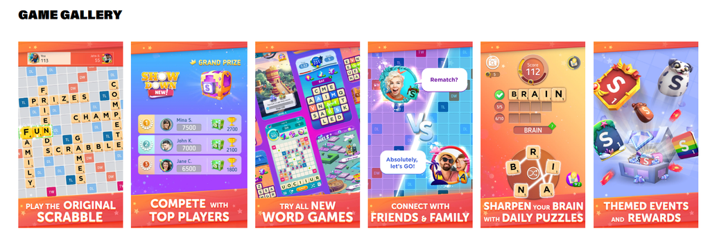
I also like the Game Gallery section because it gives visitors a closer look at what the game actually looks like. It includes several images showing different parts of Scrabble GO, such as playing the original Scrabble game, competing against other players, connecting with friends and family, and trying daily word puzzles. I think this is a nice addition because visitors can see what the game has to offer instead of just reading about it. The images are also colorful and eye-catching, which helps make the website more interesting and gives visitors a better idea of what to expect when they download the game.
Navigation and User Experience
I found the website pretty easy to navigate. It uses a simple layout where visitors can scroll down to find different sections. Everything is organized in a way that makes sense, starting with an introduction to the game and ending with videos and customer support information.
One thing I noticed is that there is no search bar on the website. I do not think this is a huge problem because there is not a lot of information to search through. The website is mostly meant to introduce the game, so having a simple layout works well.

The download option is also easy to find, which is important because that is the main reason someone would visit the website. Visitors can learn about the game and download it without having to click through several different pages.
I also clicked on the customer support link, which takes visitors to a separate help center. The help center has different categories for things like accounts, gameplay, purchases, multiplayer, and advertisements. I think this is helpful because players can find answers to common questions without having to look through the entire website.
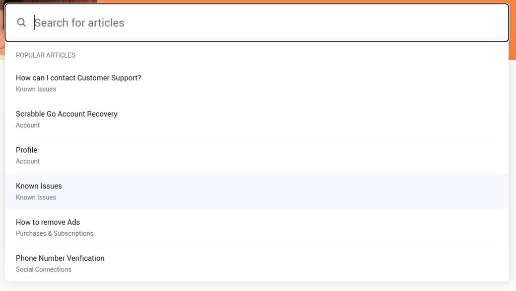
However, I think it would be better if the support page looked more like the main website. Since visitors are taken to a different page, the experience feels a little disconnected. Keeping the same design and colors across both websites would make everything feel more connected.
Another thing I noticed is that the videos are quite small when viewing them directly on the website. There is no option to make them larger or switch to full screen, so visitors have to look them up on YouTube if they want to watch them in a larger view. I think this takes away from the experience because the whole point of having the videos on the website is to let visitors watch them without having to leave the page. It would be better if the videos could be enlarged directly on the website, making them easier to watch and more convenient for visitors.
Accessibility
WAVE Tool:
To check the accessibility of the Scrabble GO website, I used the WAVE web accessibility evaluation tool. The report showed 24 errors, 15 contrast errors, and 3 alerts, which suggests there are a few areas where the website could be improved. One of the biggest issues was missing alternative text. WAVE found 23 images without alt text, which can make it difficult for screen reader users to understand what the images show. The report also found one empty heading, which could make the page structure harder to follow.
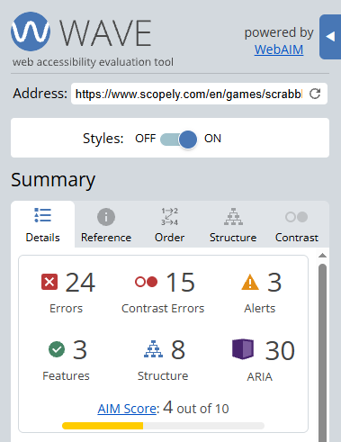
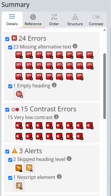
The report also showed two skipped heading levels and one no-script element. Overall, the website has some accessibility features, but the WAVE report gave it an AIM score of only 4 out of 10. I think Scopely could improve the website by adding alt text to its images, making sure the text stands out clearly against the background, and organizing its headings in the correct order. These changes would make the website easier for more people to use.
Color Contrast:
I also used a color contrast checker to see how easy the text on the website is to read. I tested two color combinations from the Scrabble GO website. The first test used purple text (#7920E2) on an off-white background (#FAFFF9), which received a contrast ratio of 6.65:1. This passed the WCAG AA requirements for normal and large text, although it did not pass AAA for normal-sized text. The second test used blue text (#0D2AAA) on a white background (#FFFFFF) and received a contrast ratio of 10.88:1. This passed both WCAG AA and AAA requirements.
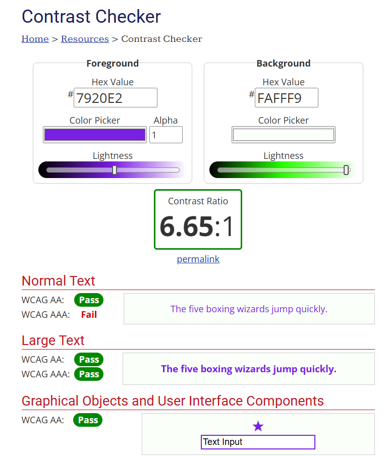
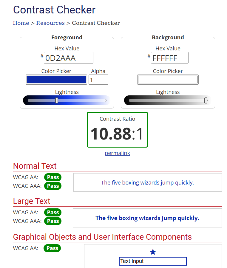
Overall, I think the color contrast on the main page is good. The website uses bright colors against either white or black backgrounds, which helps the text and other elements stand out. The contrast checker results also show that the colors I tested are readable and meet the basic accessibility requirements. However, Scopely should still check other text and color combinations throughout the website to make sure they are just as easy to see because there were 15 contrast errors on the WAVE report.
My Criticisms
One thing I didn’t like about the website is that it is not completely focused on Scrabble GO. Since the page is part of Scopely’s main website, the navigation bar at the top includes several links that take visitors to other parts of the company website.
For example, there are sections such as “About Us,” “Our Games,” “Life at Scopely,” “News,” “Join Us,” and “Creators.” These sections are mainly about Scopely as a company rather than Scrabble GO itself.

I understand why Scopely includes these links, especially since the website is meant to promote all of its games and company information. However, I think they can be distracting for someone who visits the page specifically to learn more about Scrabble GO. Visitors might end up exploring other sections instead of focusing on the game they originally came to see.
I think the page would be easier to navigate if it had more links related directly to Scrabble GO, such as game features, how to play, support, and download options. This would help keep visitors focused on the game and make the overall experience feel more organized.
Final Review
Overall, I think the Scrabble GO website does a good job of introducing the game and showing visitors what it has to offer. I like how the page is organized into different sections, uses colorful images, and includes videos that explain the game and its features. The Game Gallery is also a nice addition because it gives visitors a better idea of what the game looks like before downloading it.
There are still a few things I think could be improved. The WAVE report showed several accessibility issues, especially missing alternative text and low color contrast in certain areas. I also think the videos should have an option to enlarge or play in full screen so visitors do not have to leave the website to watch them properly. Another thing I would change is the navigation at the top of the page. Since it includes links to other parts of Scopely’s website, it can take attention away from Scrabble GO.
Even with these issues, the website is visually appealing and gives visitors a good amount of information without making the page too difficult to follow. Looking at this website also gave me some ideas for my own website, especially how to organize content into sections, use images to make a page more interesting, and keep the design consistent. Overall, I think Scrabble GO has a strong website, but a few changes could make it more accessible and easier for visitors to use.
References:
- Scrabble GO https://www.scopely.com/en/games/scrabble-go
- 2026 Webby Awards https://www.webbyawards.com/
- WAVE report https://wave.webaim.org/
- WebAIM (Color Contrast Checker) https://webaim.org/resources/contrastchecker/
Images:
- Start-up Page
- Scrabble Go description
- Game Features
- Videos
- Customer Support
- Get In Touch
- Scrabble GO Logo
- Scrabble Crossword Game Logo
- Game Gallery
- Download Now
- Customer Support Search https://scopely.helpshift.com/hc/en/28-scrabble-go/
- Wave Tool Report #1
- Wave Tool Report #2
- Color Contrast #1
- Color Contrast #2
- Main Menu