
ESPN is a popular sports media website where users can check scores, read news, watch videos, and follow their favorite teams. In this post, I will be talking about how ESPN uses Dieter Rams’s 10 Principles. Overall, I think ESPN has a good user experience, but there are a few areas where it could improve.

Dieter Rams’s 10 Principles of Good Design
1. Good Design Is Innovative
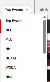
- ESPN brings sports scores, news, videos, and updates together in one place.
- I like how users can easily switch between different sports without needing to visit multiple websites.


2. Good Design Makes a Product Useful
- The website is useful because it gives sports fans quick access to the information they want.
- Scores, schedules, and news are easy to find, which is probably what most people visit ESPN for.

3. Good Design Is Aesthetic
- ESPN has a recognizable design with its red, black, and white color scheme.
- The pictures, team logos, and headlines make the website visually interesting.
- However, the homepage can sometimes feel a little crowded.
4. Good Design Makes a Product Understandable
- The navigation menu is straightforward, with different sports categories clearly labeled.
- Even someone who doesn’t regularly use ESPN could probably figure out how to find what they’re looking for.
5. Good Design Is Unobtrusive
- I think this is one area where ESPN could improve.
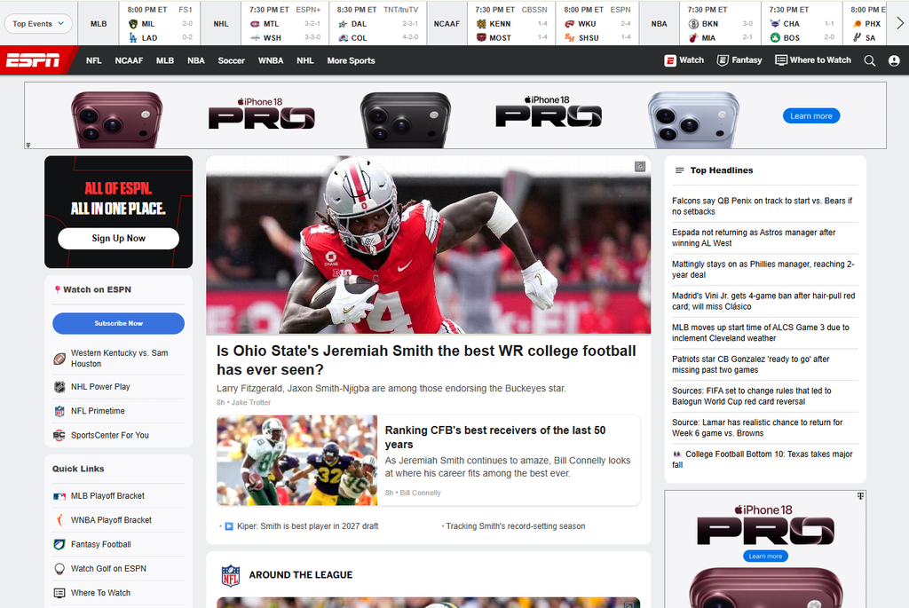
- There are a lot of articles, videos, scores, and advertisements competing for attention.
- Sometimes the amount of information makes it harder to focus on one thing.
6. Good Design Is Honest
- ESPN generally makes it clear what users can expect when clicking on different sections.
- However, I think advertisements and promotional content could be separated more clearly from regular news.
7. Good Design Is Long-Lasting
- ESPN uses familiar navigation features that people are already comfortable with.
- Even though sports news changes constantly, the overall layout is something users can continue to understand over time.
8. Good Design Is Thorough Down to the Last Detail
- ESPN does a good job organizing information into different sports, leagues, and teams.
- Small details like team logos and score displays help users recognize information quickly.
9. Good Design Is Environmentally Friendly
- This principle is harder to judge just by looking at a website.
- However, ESPN could potentially reduce its environmental impact by limiting unnecessary videos and making its pages load more efficiently.
10. Good Design Involves as Little Design as Possible
- I don’t think ESPN completely follows this principle.
- The homepage has so much information that it can feel overwhelming.
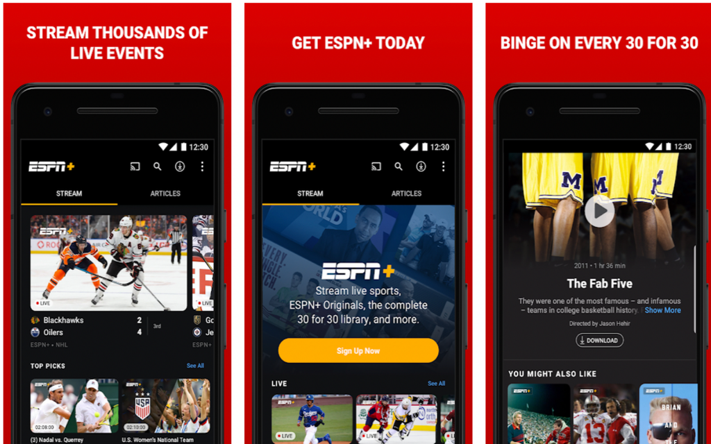
- A simpler layout like their mobile app would look and function a lot better.
Does ESPN Make You Think?
One important part of user experience is whether people have to stop and think about how to navigate a website.
- Easy navigation: ESPN has clearly labeled menus for different sports, making it easy to know where to click.
- Familiar layout: Most users already understand how menus, search bars, and clickable headlines work.
- Too much content: The homepage can feel overwhelming because there are so many different things to look at.
- Clear navigation cues: If I wanted to check an NBA score, I would know to click on the NBA section without having to think too much about it.
Overall, I think ESPN does a good job of making its website easy to navigate and understand. Users can find the information they are looking for without having to spend too much time figuring out where everything is. The website has a clear layout, organized menus, and sections that make it easy to move between different sports, scores, and news articles. While there are some areas that could be improved, I don’t think the website makes users think too much about how to use it. This is an important part of good UX design because a website should feel simple and natural to navigate rather than confusing or overwhelming.
Overall User Experience
What ESPN Does Well:
- Easy-to-understand navigation
- Quick access to scores and sports news
- Consistent design and recognizable branding
- Clear organization of different sports and leagues
What ESPN Could Improve:
- Reduce clutter on the homepage
- Make advertisements less distracting
- Simplify the layout so users can focus on what they need
Final Thoughts
Overall, I think ESPN has a good user experience because it is useful, organized, and fairly easy to navigate. It follows many of Dieter Rams’s principles, especially when it comes to usefulness and making a product understandable. However, I think the website could benefit from a simpler homepage with fewer distractions. A good website shouldn’t make users work hard to find information, and while ESPN does a good job with navigation, there is still room for improvement.

Dieter Rams